I am working on a series of paintings inspired by the ancient Irish Ogham Tree Alphabet. The letters were carved into stones throughout Ireland, and they were associated with particular trees. The tree letter I worked on the past few weeks was Huath, which is correlated with the Hawthorn. I collected a few photos of hawthorn trees and bushes and they were mostly covered with white five-petaled blossoms. I drew abstract forms on my wood panel, the ones I use a lot: the double vesica piscis, symbolizing twin souls or love; the arch, which can be thought of as a portal, the spiral, a well-known Celtic symbol, and a sort of "donut" shape, which I simply like. I also drew some small flowers and leaves and the bird connected with the hawthorn, the owl.
Then I added some large hawthorn flower shapes, but they just competed with the larger abstract shapes, so, disgusted, I covered the background with iridescent green paint:
At that point I had no idea what to do with the painting. I disliked the shiny green, but I could notcome up with a way to tie it to the hawthorn. After a couple of months I was watching a video of an art teacher, and she suggested working in Procreate as a sketchbook. I didn't know how to use Procreate very well, but I searched for how to put a transparent layer on an image, and started playing. I looked for more photos online of the hawthorn, and found a branch that seemed graceful and interesting, with leaves and berries.
I pulled that photo into procreate and traced it, to make this simple drawing:
I copied the branch drawing onto a transparent layer three times, in different angles, and colored it in the way I wanted it to look over my abstract shapes.
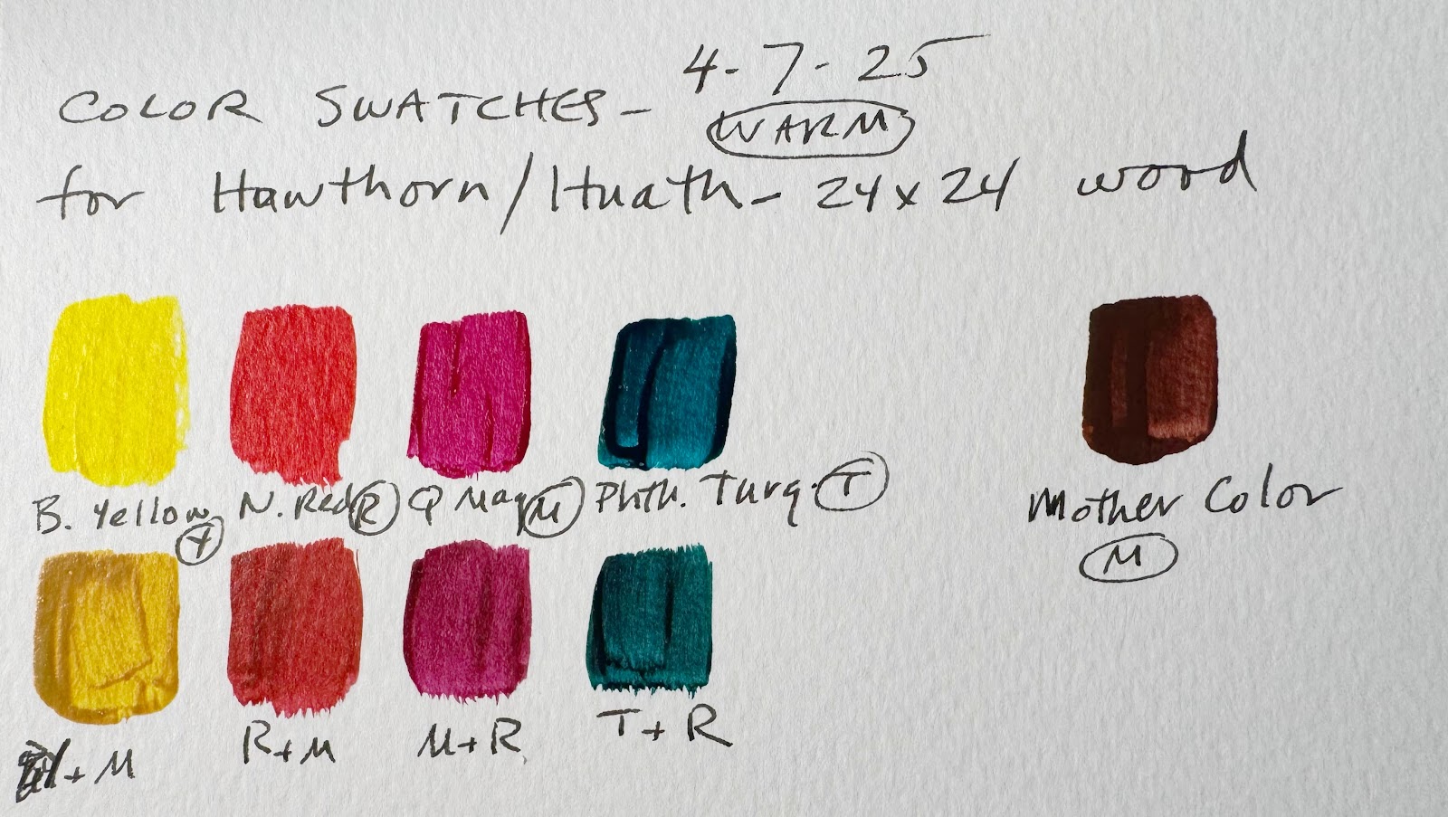
Now I was getting somewhere! I drew the branches onto the painting and eliminated the large flower shapes at the same time. I also drew waving lines through the entire image, and began to fill them in with mixtures of my chosen palette, which was Benzimidazalone Yellow, Quinacridone Magenta, Naphthol Red Light, and Phthalo Turquoise. I also made a mixture of all four pigments to use as a "mother color", which is one way to harmonize colors. The swatches are the pure colors, and below them are the colors with a bit of the mother color added. They are much more compatible, at least to my eye, with the mother color mixed in.
This painting had promise, and I might have left it there, but I was not satisfied. I took a photo of it and pulled the image back into Procreate, to make some experimental versions of it:
Okay so now what? Meanwhile, my daughter Laura was telling me about her playing with Chat GPT to do mockups of her project of inspiration cards. I decided to follow her lead and I got the app on my iPad and told it what I was working on, asking for ideas on how to get this painting to work. ChatGPT noticed that I had used the larger shapes from my series, but that the other paintings also had smaller shapes, like spirals, in the background. I added those and then experimented in Procreate again, trying to integrate the elements. I asked ChatGPT to come up with mockups of a successful painting. It came up with two mockups that were not exactly going in the direction I wanted, but I gleaned a concept from them anyway.
These two mockups are what ChatGPT could create. they gave me two basic ideas: one, glaze the background collage elements to push them backwards, and two, paint the abstract shapes one color each, so that they do not contain smaller components that compete with the main focus, the branches.
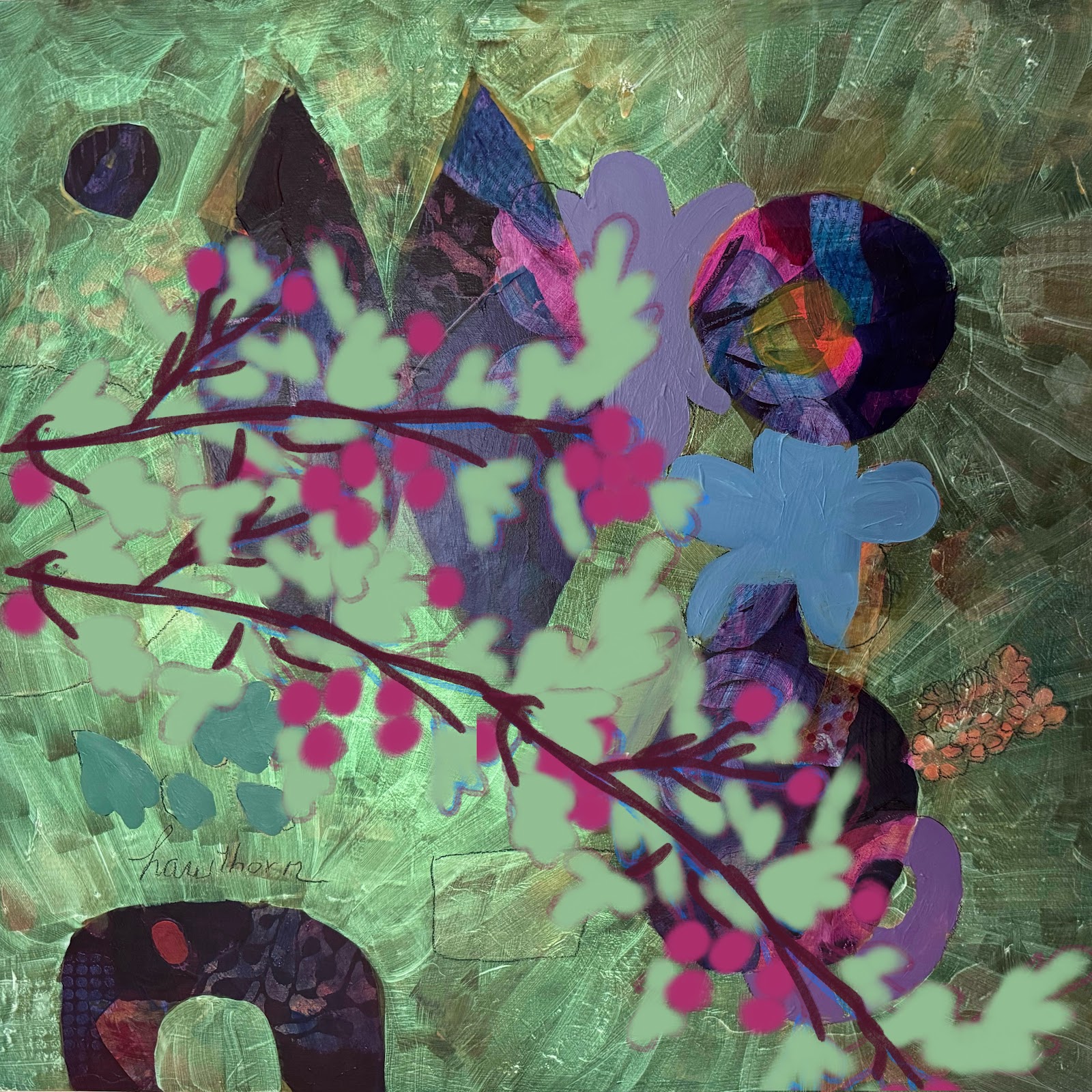
Here it is with the collage pieces added, before I worked on the background.
I simplified the abstract shapes using various mixtures of the reds and glazed the collage pieces with Phthalo Turquoise, to knock them back. This is the final version, Hawthorn / Huath. I am quite pleased with it and I uploaded it onto my website as well as posting it on Instagram.


Comments